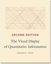
One of my current projects is reading the complete works of Edward Tufte, one of the giants in information design. For better or worse I’ve decided to read the books in order of original publication date, and although The Visual Display of Quantitative Information, 2nd edition was originally published in 1983 most of its principles are still easily applicable today.
One great thing about the book is that it immediately conveys Tufte’s strong sense of history, providing a solid foundation in understanding the evolution of infographics through the past couple centuries. Tufte’s writing is crisp and direct, supported by page layouts that are simple and approachable. Most of his historical examples are interesting (including Charles Joseph Munard’s famous infographic of Napoleon’s (death) March), and he gets some good ribbing in when he presents his statistical studies on the complexity of the infographics found in modern (for the 80’s) print publications. Surprisingly the New York Times gets a lashing, though as anyone who peruses the Times website these days knows they’ve now got a ridiculously crackerjack infographics team that could very well represent the publication’s future.
Here are the two key principles I took away from this first volume:
- Data should never lie. This means being absolutely accurate in representing visual proportions and relationships in your graphics, as well as eliminating any possible confusion in presentation: clearly labeling your data, avoiding harsh coloring/shading patterns, etc.
- Give your audience more credit. What this really boils down to is that Tufte places a premium on conveying information efficiently, condemning modern graphics for being overly simplistic and bloated “chartjunk.” He goes to great lengths to measure each graphic’s efficiency with two key ratios: the first is the ratio of ink used for data points vs. ink that doesn’t represent actual data, and the second is a measure of how many data points are presented per square inch or square centimeter. His metrics and analysis are endearingly thorough.
These principles are clearly just good user interaction design, though it’s surprising how often they still get violated (I’m looking at you, USA Today). Overall, the book is a brisk and fun read. It’s even inspired me to create some of my own personal infographics, though I suspect most of my ideas won’t pack in quite the data density that Tufte would approve of.
Regardless, I’m really looking forward to cracking open the later books in his oeuvre to see how his design sense (and page layouts) evolve throughout the next few decades. Up next: 1990’s Envisioning Information.